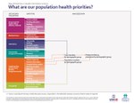
Map of Data Flow in Health Information Systems (A series of four)
 gr-18-016.pdf
—
PDF document,
120 kB (123,531 bytes)
Author(s): J. C. Thomas
Year: 2018
 Abstract:
This set of illustrations poses four basic questions about health system performance and illustrates how the data generated by functioning health information systems (HIS) contribute to that performance. The questions move from policy to use of resources and health outcomes:
- What are our population health priorities?
- What resources do we have to address our priorities?
- Are we using our resources efficiently?
- Are we making progress on our priorities?
The graphics also outline the data sources that generate the information to answer those questions. Data sources considered are government health entities from districts or national levels; medical stores; laboratories; community organizations; health facilities, both public and private; and household data from population surveys. The four flow charts illustrate which entities generate data that are contributing to the overall picture of health trends, disease prevalence, available medical commodities, and population trends. The understanding of these aspects of health are an aid to decision makers who must make judgments about how to allocate resources, where more staff are needed, what programs are working, and what health policies might need to change.
Access additional health information systems infographics and models.


