Lesson 3: Life Tables
3.0 Overview
The goal of this lesson is to review elements of ordinary life tables that are essential to understanding multiple-decrement life tables.
The focus of the first section (3.1) is on understanding what the columns of an ordinary life table reveal. The second section (3.2) shows how to construct a life table.
For more extensive coverage of ordinary life tables, see Population Analysis for Planners, another free, online course developed as part of the DAPR project.
Download a zip file containing data for Lesson 3 in Excel and CSV formats.
3.1 An Ordinary Life Table
An ordinary life table is a statistical tool that summarizes the mortality experience of a population and yields information about longevity and life expectation. Although it is generally used for studying mortality, the life table format can be used to summarize any duration variable, such as duration of marriage, duration of contraceptive use, etc.
An Example of a Life Table
A typical life table contains several columns, each with a unique interpretation. We will learn about these columns and their interpretations by examining an illustrative life table. First, an introduction to the notation:
|
Table 3.1.1: Life Table Column Notation
|
||
| Column | Notation | Definition |
|---|---|---|
| 1 |
(x, x+ n)
|
Age interval or period of life between two exact ages stated in years |
| 2 |
nqx
|
Proportion of persons alive at the beginning of the age interval who die during the age interval |
| 3 |
lx
|
Of the starting number of newborns in the life table (called the radix of the life table, usually set at 100,000) the number living at the beginning of the age interval (or the number surviving to the beginning of the age interval) |
| 4 |
ndx
|
The number of persons in the cohort who die in the age interval (x, x+ n) |
| 5 |
nLx
|
Number of years of life lived by the cohort within the indicated age interval (x, x+ n) (or person-years of life in the age interval) |
| 6 |
Tx
|
Total person-years of life contributed by the cohort after attaining age x |
| 7 |
ex0
|
Average number of years of life remaining for a person alive at the beginning of age interval x |
The table below (Table 3.1.2) gives an ordinary life table of the 1997 United States population (adapted from NCHS; National Vital Statistics Reports Vol. 47, No. 19, June 30, 1999).
Table 3.1.2: Abridged Life Table for the Total United States Population, 1997
|
||||||
| (1) Age Interval (x, x + n) | (2) nqx | (3) lx | (4) ndx | (5) nLx | (6) Tx | (7) ex0 |
|---|---|---|---|---|---|---|
| < 1 | 0.00723 | 100000 | 723 | 99371 | 7650789 | 76.5 |
| 1-4 | .00144 | 99277 | 143 | 396774 | 7551418 | 76.1 |
| 5-9 | .00092 | 99135 | 91 | 495432 | 7154644 | 72.2 |
| 10-14 | .00116 | 99043 | 115 | 494997 | 6659212 | 67.2 |
| 15-19 | .00374 | 98929 | 370 | 493801 | 6164215 | 62.3 |
| 20-24 | .00492 | 98558 | 485 | 491596 | 5670414 | 57.5 |
| 25-29 | .00509 | 98073 | 499 | 489137 | 5178818 | 52.8 |
| 30-34 | .00630 | 97574 | 615 | 486397 | 4689680 | 48.1 |
| 35-39 | .00840 | 96959 | 814 | 482862 | 4203284 | 43.4 |
| 40-44 | .01196 | 96145 | 1149 | 478017 | 3720422 | 38.7 |
| 45-49 | .01757 | 94996 | 1669 | 471055 | 3242404 | 34.1 |
| 50-54 | .02618 | 93327 | 2443 | 460915 | 2771349 | 29.7 |
| 55-59 | .04123 | 90884 | 3747 | 445708 | 2310434 | 25.4 |
| 60-64 | .06457 | 87136 | 5627 | 422450 | 1864727 | 21.4 |
| 65-69 | .09512 | 81510 | 7753 | 389159 | 1442277 | 17.7 |
| 70-74 | .14365 | 73757 | 10595 | 343402 | 1053118 | 14.3 |
| 75-79 | .20797 | 63162 | 13135 | 284018 | 709716 | 11.2 |
| 80-84 | .31593 | 50026 | 15805 | 211466 | 425698 | 8.5 |
| 85-89 | .46155 | 34221 | 15795 | 130736 | 214232 | 6.3 |
| 90-94 | .62682 | 18427 | 11550 | 60800 | 83496 | 4.5 |
| 95-99 | .77325 | 6876 | 5317 | 18825 | 22696 | 3.3 |
| 100+ | 1.0000 | 1559 | 1559 | 3871 | 3871 | 2.5 |
Interpretation of and Relationships among the Columns
The nqx column has a probabilistic interpretation:
nqx ~ Probability that a person of age x will die in the
age interval (x, x + n)
Also note that 
| Or with reference to the columns, | Column 2 =  |
|
Example in Table 3.1.2: |
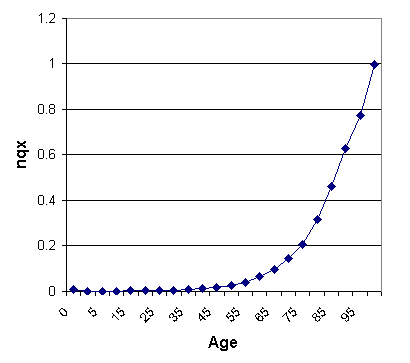
A graph of nqx across the life span is given in Figure 3.1.1. A graph of age-specific death rates would have a similar shape.
Figure 3.1.1: nqx across the Life Span for US 1997
The lx column also has a probabilistic interpretation:
 |
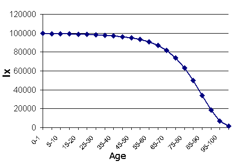
~ | Proportion of the newborns surviving to that age (In Table 3.1.2, divide Column 3 by 100,000.) |
These proportions are called survival probabilities. A plot of the survival probabilities across the life span is given in Figure 3.1.2.
Figure 3.1.2: lx across the Life Span for US 1997
There are simple relationships between the ndx column and the lx and the nqx columns in the life table:
(a) (In Table 3.1.2 multiply Column 3 by Column 2.)
|
Example From Table 3.1.2: |
(b) Because everybody eventually dies, the sum of the number of deaths in all the age intervals will be equal to the radix of the life table, i.e.:

|
Example In Table 3.1.2: The sum of the ndx column is equal to 100,000 = l0 |
(c) The relationships in (b) can be extended as follows:
Because everybody who survives to age x will eventually die, the sum of deaths from that age to the end of the table will be equal to the number surviving to that age, i.e.:

|
Example In Table 3.1.2: |
(d) Number of persons dying before a specified age x is the sum of deaths from the beginning of the table to that specified age:
Number dying before age x =
|
Example In Table 3.1.2, the number of
|
(e) From (d) above, the proportion (probability) that a newborn will die before reaching age x is calculated as:

|
Example In Table 3.1.2, the probability
|
(f) Although not shown in the life table, one useful quantity to calculate from the table is the proportion surviving each age interval. This proportion is denoted as npx. Note that:

Therefore, 
Also note that one can write:
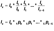
Or the lx column is related to the npx column by the relation:

Thus, one can compute the cumulative survival function as the product of survival probabilities of each interval:
|
Example In Table 3.1.2:
|
Exercise 6
Question 1
The radix of the life table is usually 100,000 but may be a different number. Where in an ordinary life table can you always look to find out what the radix is?
- In the first row of Column 7
- In the first row of Column 3
- In the last row of Column 7
- In the last row of Column 1
Question 2
According to Column 7 of Table 3.1.2, a newborn in the US in 1997 may expect to reach age 76.5. Once that child gets to age 50, what age would he/she expect to reach?
- No change -- 76.5
- 29.7
- 79.7
- 63.8
Question 3
According to Table 3.1.2, of those born in the US in 1997 who make it to age 70, what percentage are expected to die before they reach age 75?
- 14%
- 20%
- 6%
- 9%
Question 4
According to Table 3.1.2, what is the probability of a newborn in the US in 1997 surviving to age 20?
- .992
- .950
- .986
- .917
3.2 Construction of an Ordinary Life Table
Knowledge of ordinary life table construction is essential in the construction of a multiple-decrement life table. There are a number of methods available to construct an ordinary life table using data on age-specific death rates. The most common methods are those of Reed Merrell, Greville, Keyfitz, Frauenthal, and Chiang (for a discussion of these methods see Namboodiri and Suchindran, 1987).
In this section we construct an ordinary life table with data on age-specific death rates based on a simple method suggested by Fergany (1971. "On the Human Survivorship Function and Life Table Construction," Demography8(3):331-334). In this method the age-specific death rate (nmx) will be converted into the proportion dying in the age interval (nqx ) using a simple formula:
Formula (1)

where e is the symbol for the base number of a natural log (a constant equal to 2.71828182...) and n is the length of the age interval. (Note: do not confuse the symbol e here with the ex0 used in "expected life" notation.)
Once nqx is calculated with age-specific death rates, the remaining columns of the life table are easily calculated using the following relationships:
 |
|
 |
(As in Table 3.1.2, multiply Column 3 by Column 2.) |
 |
(As in Table 3.1.2, subtract Column 4 from Column 3.) |
 |
(Divide Column 4 in Table 3.1.2 by the corresponding age-specific death rate. Note: Table 3.1.2 did not use the Fergany method.) |
 |
(Obtain cumulative sums of Column 5 in Table 3.1.2.) |
 |
(In Table 3.1.2, divide Column 6 by Column 3.) |
|
Example Converting the Age-Specific Death Rate into the Proportion Dying in the Age Interval Table 2.5.2 of Lesson 2.5 shows that the age-specific death rate for age group 1-4 (4m1) for Costa Rican males in 1960 is .00701 per person. (Keep in mind that tables presenting age-specific death rates will usually present the rate as "number of deaths per 1000 people," but in the calculations used in constructing an ordinary life table, the age-specific death rate is "number of deaths per person.") Using formula (1) from above,
|
Fergany Method, Step by Step
In this example we use the age-specific death rates from Table 2.5.2 of Lesson 2.5 to complete the construction of a life table for 1960 Costa Rican males. We will follow the Fergany Method.
Step 1
Obtain age-specific death rates. Note that age-specific death rates are per person (Column 2 of Table 2.5.2).
Step 2
Convert age-specific death rates (nMx) to the proportion dying in the age interval (nqx) values using the following formula (formula (1) from above): , where n is the length of the age interval
|
Table 3.2.1: Life Table Construction: 1960 Costa Rican Males
|
|||||||
| (1) | (2) | (3) | (4) | (5) | (6) | (7) | |
|---|---|---|---|---|---|---|---|
| Age Interval | nmx | nqx |
lx
| ndx | nLx |
Tx
|
ex0
|
| <1 year | 0.07505 | 0.07230 | 100,000 | 7,230 | 96,340 | 6,297,331 | 62.97331 |
| 1-4 | 0.00701 | 0.02765 | 92,770 | 2,566 | 365,924 | 6,200,991 | 66.84287 |
| 5-9 | 0.00171 | 0.00851 | 90,204 | 768 | 449,098 | 5,835,067 | 64.68736 |
| 10-14 | 0.00128 | 0.00636 | 89,436 | 569 | 445,757 | 5,385,970 | 60.22141 |
| 15-19 | 0.00129 | 0.00641 | 88,867 | 570 | 442,912 | 4,940,212 | 55.59081 |
| 20-24 | 0.00181 | 0.00899 | 88,298 | 793 | 439,502 | 4,497,301 | 50.93332 |
| 25-29 | 0.00163 | 0.00814 | 87,504 | 712 | 435,739 | 4,057,798 | 46.37254 |
| 30-34 | 0.00198 | 0.00984 | 86,792 | 854 | 431,822 | 3,622,059 | 41.73255 |
| 35-39 | 0.00302 | 0.01497 | 85,938 | 1,287 | 426,465 | 3,190,237 | 37.12251 |
| 40-44 | 0.00442 | 0.02184 | 84,651 | 1,849 | 418,616 | 2,763,772 | 32.64896 |
| 45-49 | 0.00645 | 0.03175 | 82,802 | 2,629 | 407,402 | 2,345,156 | 28.32242 |
| 50-54 | 0.00923 | 0.04509 | 80,173 | 3,615 | 391,758 | 1,937,754 | 24.16966 |
| 55-59 | 0.01344 | 0.06498 | 76,558 | 4,975 | 370,214 | 1,545,996 | 20.19379 |
| 60-64 | 0.02364 | 0.11146 | 71,583 | 7,979 | 337,577 | 1,175,782 | 16.42535 |
| 65-69 | 0.03633 | 0.16609 | 63,605 | 10,564 | 290,813 | 838,205 | 13.17838 |
| 70-74 | 0.05182 | 0.22826 | 53,040 | 12,107 | 233,629 | 547,391 | 10.32027 |
| 75-79 | 0.07644 | 0.31765 | 40,933 | 13,002 | 170,095 | 313,763 | 7.665223 |
| 80-84 | 0.13520 | 0.49135 | 27,931 | 13,724 | 101,508 | 143,668 | 5.143692 |
| 85+ | 0.33698 | 1.00000 | 14,207 | 14,207 | 42,160 | 42,160 | 2.967532 |
|
Step 2 Examples For age interval 0-1:
For age interval 1-4:
For age interval 5-9: For age interval 85+: |
Step 3
Use nqx to compute lx values in Column 3.
First set  = 100,000
Then  =
= 
Or in general... 
(Note: This computational formula is easy to implement on the spreadsheet. First compute l1 and copy to the remaining cells of the column.)
|
Step 3 Examples
|
Step 4
Calculate the number of deaths in age intervals ( ) in Column 4 as:
 (Column 3 * Column 2)
Note: Sometimes it is easy to implement Steps 3 and 4 simultaneously:
First write  = 100,000
Then calculate:
 (Round to integer)
Then:

Step 5
In Column 5, compute the person-years of life in the indicated age interval ( ) as:
) as:
 (Column 4 / age-specific death rate)
|
Step 5 Example
|
Step 6
In Column 6, compute the cumulative person-years of life after a specified age (Tx):
 |
(Sum values in Column 6 from a specified age to the end of the table.) |
|
Step 6 Examples  |
Step 7
The final column of the life table (Column 7) is the expectation of life at specified ages. This column is computed as:
 (Column 6 / Column 3)
|
|
The life table construction is complete with the implementation of Step 7.
Selected Features of the Life Table
We will examine some features of the constructed life table that are relevant to the construction and interpretation of a multiple-decrement life table:
1. Sum of the  values in Column 4 will be equal to 100,000 (=
  ).
).
2. Sum of the  values in Column 4 from a specified age will be equal to the
  value at this age as shown in Column 3.
For example:
Thus, one can interpret
as the cumulative number of deaths after a specified age.
3. Age at which people in the life table cohort die is also important in our understanding of the age pattern of death. The  column (Column 4 of the life table) gives the frequency distribution of the age at death in the population.
A graph of this frequency distribution will show the age pattern of death in the population. Unfortunately, this frequency distribution is given in age intervals of unequal length (and an open-ended interval at the end). Therefore a graph adjusting for the unequal age intervals is more appropriate for this life table.
Figure 3.2.1 shows the pattern of the age distribution of deaths from the life table above (Table 3.2.1). Note that in this example the open-ended age interval 85+ is closed at 85-100. The proportion of deaths in each age group is divided by the length of the age interval. The graph is drawn by connecting the values at the midpoint of each interval.
Figure 3.2.1: Age Distribution of Deaths for 1960 Costa Rican Males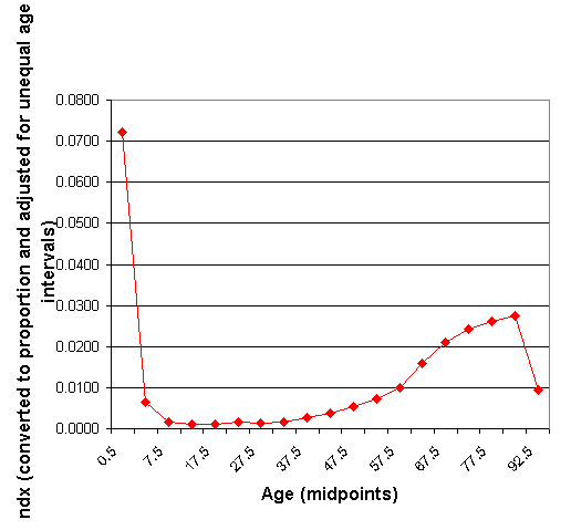
The graph shows that a high proportion of the cohort dies in infancy. The deaths decrease until early adulthood, rise until age 80, and then begin to decrease again at the extreme ages. Note that the sharp decrease at the far right is due to the small number of extremely old survivors in this population.
4. The cumulative number of deaths from the beginning of life also can be calculated by summing the appropriate numbers in Column 4. For example, the number of persons in the cohort dying before reaching age 15 is:

Note that this number also can be calculated as:

Thus, proportion dying before reaching age 15 is:

Exercise 7
Note to students: This longer exercise will require the use of spreadsheet software. Good luck!
Use the data on age-specific deaths of the 1960 Costa Rican females from Exercise 5 to construct a life table using Fergany's Method as described above. (You downloaded the data file you need here as part of Exercise 5.)
Then use your constructed life table to do the following:
- Draw graphs of the
 and
and  columns. Briefly describe these graphs.
 - Draw a graph of the age distribution of deaths (adjusting for the unequal age intervals) using the
 column in the life table. Comment on the age pattern of mortality depicted in this graph.
 - Verify that
 is the sum of the ndxcolumn from age 65 to the end of the table.
Once you have finished your work, compare your results to the answer key below.
Answers To Exercises
Exercise 6
Question 1
The radix of the life table is usually 100,000 but may be a different number. Where in an ordinary life table can you always look to find out what the radix is?
B. In the first row of Column 3. The radix is simply the starting number of newborns for the life table. Since Column 3 gives the starting number of people at each age interval, the first row gives the number of people starting at age 0. In this case, it is 100,000, as usual.
Question 2
According to Column 7 of Table 3.1.2, a newborn in the US in 1997 may expect to reach age 76.5. Once that child gets to age 50, what age would he/she expect to reach?
C. 79.7. Column 7 tells, on average, how many more years of life are expected for people who made it to the start of the age interval. So a 50-year-old would expect another 29.7 years to live on average (50 + 29.7 = 79.7).
Question 3
According to Table 3.1.2, of those born in the US in 1997 who make it to age 70, what percentage are expected to die before they reach age 75?
A. 14%. Column 2 gives the proportion of persons alive at the beginning of the age interval who die during the age interval. So a 70-year-old has a .14365 (rounded to 14%) chance of dying during the 70-75 age interval.
Question 4
According to Table 3.1.2, what is the probability of a newborn in the US in 1997 surviving to age 20?
C. .986. Since Column 3 gives the number of people surviving to the beginning of the age interval (98,558 made it to age 20) and you know the number of people that started (100,000), the probability of making it to age 20 is 98,558/100,000 = .98558.
Exercise 7
Use the data on age-specific deaths of the 1960 Costa Rican females from Exercise 5 to construct a life table using Fergany's Method as described above. (You downloaded the data file you need here as part of Exercise 5.)
Then use your constructed life table to do the following:
- Draw graphs of the
 and
and  columns. Briefly describe these graphs.
 - Draw a graph of the age distribution of deaths (adjusting for the unequal age intervals) using the ndx column in the life table. Comment on the age pattern of mortality depicted in this graph.
- Verify that
 is the sum of the ndxcolumn from age 65 to the end of the table.
Exercise 7, Answer: Life Table: 1960 Costa Rican Females
|
|||||||
| (1) | (2) | (3) | (4) | (5) | (6) | (7) | |
|---|---|---|---|---|---|---|---|
| Age Interval | nmx | nqx | lx | ndx | nLx | Tx | ex0 |
| <1 year | 0.0640 | 0.0620 | 100000 | 6199 | 96,868 | 6,544,328 | 65.44 |
| 1-4 | 0.0077 | 0.0303 | 93801 | 2840 | 369,496 | 6,447,460 | 68.74 |
| 5-9 | 0.0017 | 0.0084 | 90961 | 761 | 452,900 | 6,077,964 | 66.82 |
| 10-14 | 0.0010 | 0.0048 | 90200 | 429 | 449,925 | 5,625,064 | 62.36 |
| 15-19 | 0.0008 | 0.0042 | 89771 | 377 | 447,912 | 5,175,139 | 57.65 |
| 20-24 | 0.0013 | 0.0063 | 89394 | 565 | 445,556 | 4,727,227 | 52.88 |
| 25-29 | 0.0018 | 0.0087 | 88829 | 776 | 442,202 | 4,281,672 | 48.20 |
| 30-34 | 0.0023 | 0.0113 | 88053 | 993 | 437,779 | 3,839,470 | 43.60 |
| 35-39 | 0.0028 | 0.0137 | 87060 | 1191 | 432,318 | 3,401,690 | 39.07 |
| 40-44 | 0.0029 | 0.0146 | 85870 | 1251 | 426,212 | 2,969,373 | 34.58 |
| 45-49 | 0.0046 | 0.0229 | 84618 | 1940 | 418,222 | 2,543,161 | 30.05 |
| 50-54 | 0.0070 | 0.0343 | 82678 | 2833 | 406,265 | 2,124,939 | 25.70 |
| 55-59 | 0.0105 | 0.0511 | 79845 | 4078 | 388,937 | 1,718,675 | 21.53 |
| 60-64 | 0.0188 | 0.0896 | 75766 | 6789 | 361,591 | 1,329,737 | 17.55 |
| 65-69 | 0.0288 | 0.1340 | 68977 | 9241 | 321,227 | 968,146 | 14.04 |
| 70-74 | 0.0462 | 0.2062 | 59736 | 12317 | 266,702 | 646,918 | 10.83 |
| 75-79 | 0.0678 | 0.2874 | 47419 | 13626 | 201,109 | 380,216 | 8.02 |
| 80-84 | 0.1329 | 0.4853 | 33793 | 16401 | 123,455 | 179,108 | 5.30 |
| 85+ | 0.3125 | 1.0000 | 17392 | 17392 | 55,653 | 55,653 | 3.20 |
Then use your constructed life table to do the following:
1. Draw graphs of the  and
and  columns. Briefly describe these graphs.
 across the Life Span for 1960 Costa Rican Females
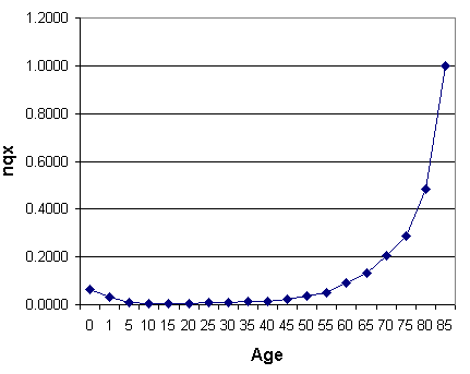
The proportion of people who die during the age interval is a little higher in the first two age intervals, low and flat until about age 45, and rises fairly steeply after that until it is 1.0 for the 85+ age group.
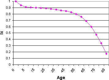
Naturally, the number of people alive at the start of each interval starts dropping more rapidly around age 45.
2. Draw a graph of the age distribution of deaths (adjusting for the unequal age intervals) using the ndx column in the life table. Comment on the age pattern of mortality depicted in this graph.
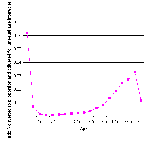
The greatest mortality rate is in the very first age interval. After the second age interval, mortality rates are low and flat before they start rising at around 47.5 (age interval midpoint), peaking at 82.5. The steep drop in the last age group is partly because of the small number of survivors and partly because it is an open-ended interval. If the table continued with five-year intervals, the drop would appear to be more gradual.
3. Verify that  is the sum of the ndxcolumn from age 65 to the end of the table.
 = 68977 = 9241 + 12317 + 13626 + 16401 + 17392


 ) = .07505
 =
=  ) = 0.00701
 =
=  ) = 0.00171
 =
=  (Round to integer)
 (Round to integer)


